Objective
Objective
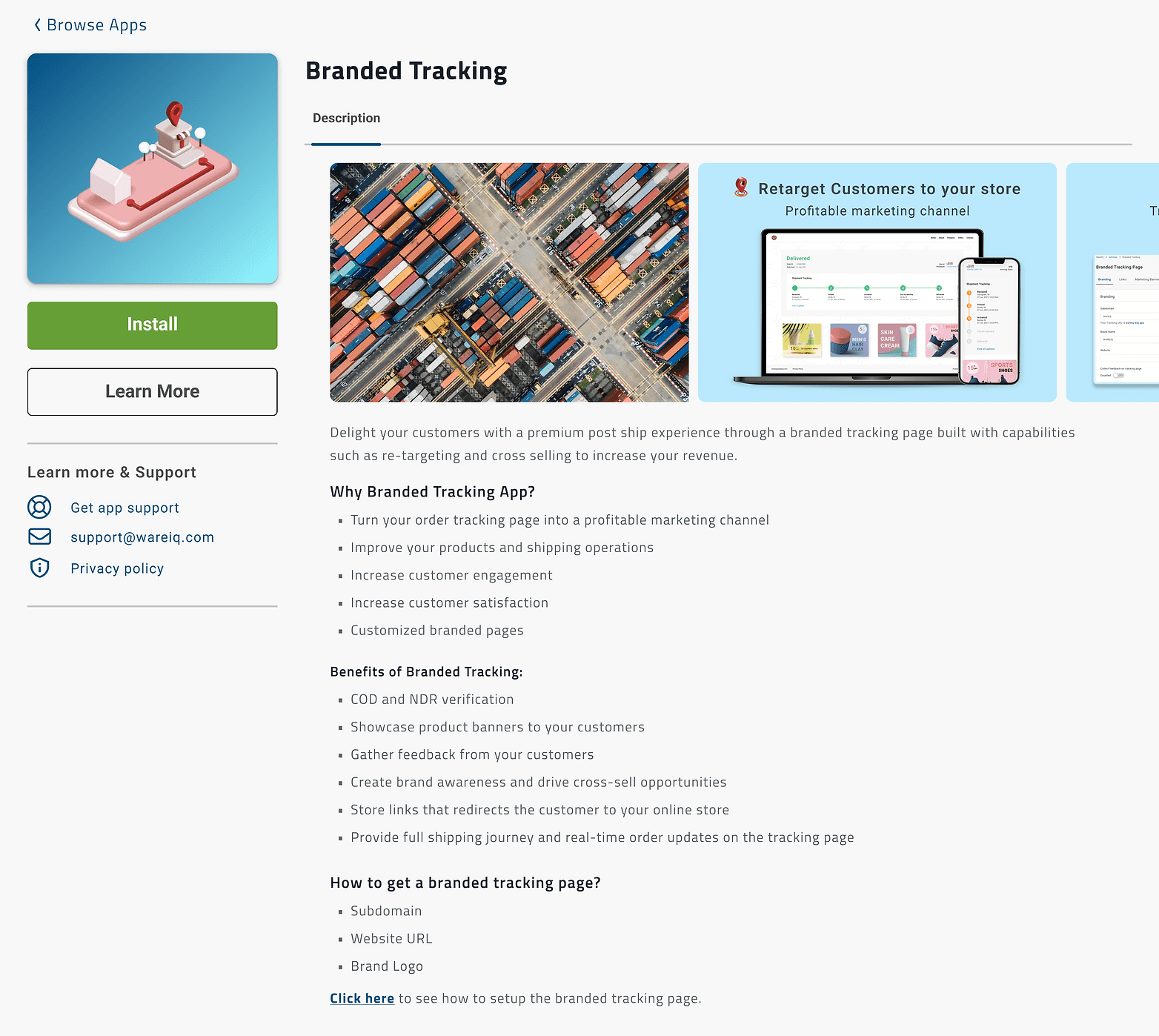
Design detail pages for each app that clearly and concisely communicate the app's features and advantages. Additionally, the pages should allow users to install and uninstall the app directly from the page.
Deliverables & User stories
An exhaustive page dedicated to each application within the WareIQ Web App.
Each page must illustrate the principal functions of the specific App.
Users should have the ability to install and remove the App.
An option to include a video guide for the users' benefit should be present.
The page must be rich in details yet straightforward.
Collecting Inspiration
Inspiration from others
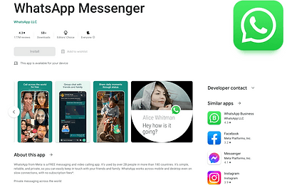
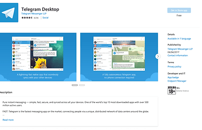
Numerous large scale technology firms have set a precedent with this approach. Garnering design concepts from esteemed entities can significantly enhance my design capabilities. By absorbing lessons from leaders in the field, I can develop designs that are not just powerfully operative but also aesthetically pleasing. We drew our inspiration from the App Stores of Google and Microsoft which were transparent and unambiguous.
Wireframing
Low fedelity Wireframing
The initial wireframing of an app store design is an important step in the design process.
It allowed me to map out the user interface and flow of the app before any design is done.This can help to identify any potential problems and make sure that the whole design is user-friendly.
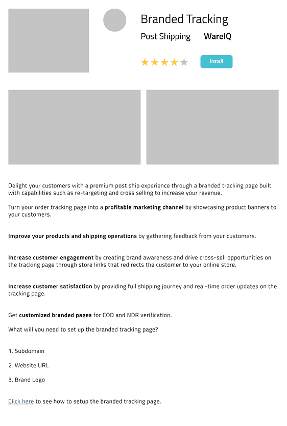
To better grasp the design, we crafted a first draft of the App Store page.
Iteration 1
Design Notes
In the first design, we added sample logos and banners to the app store page. We also added an install button and a brief description of each app.
Feedbacks
Feedbacks after Discussion
The install button was too small and difficult to see,The install button was located in an unexpected place.
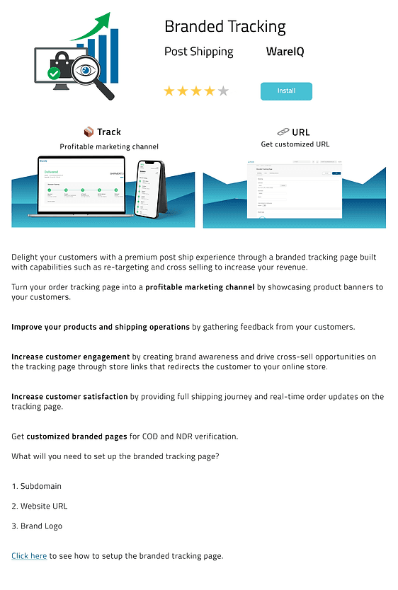
The app banners are too plain and boring. They don't use any interesting visuals or colours,The app banners are not very effective at getting users to scroll. They're not visually appealing.
The app description is not well organized. The information is not presented in a logical way, and it's difficult to find the information the users are looking for.
It is not a good idea to show the app screen in place of a logo, even if the app has an acronym. Additionally, the acronym may not be familiar to all users, which can further add to the confusion.
Iteration 2
Changes Made
A sample logo was created using the company's branding guidelines. The logo was then incorporated into the design
The banners in the App Store page were redesigned to be more visually appealing and engaging.
The background of the banners was changed to a more vibrant colour scheme, and emojis were added to the top of the banners to make them more eye-catching.
Feedbacks
Feedbacks after Discussion
The install button was not large enough or visually prominent enough to encourage users to click on it. Making the button green, which is a colour that is often associated with "go" or "action," might make it more noticeable and encourage more users to install the app.
Currently, we are not taking reviews for our product as it is still in the early stages of development. We are still working on improving the product and making sure that it is up to our standards before we open it up to reviews.
Iteration 3
Changes Made
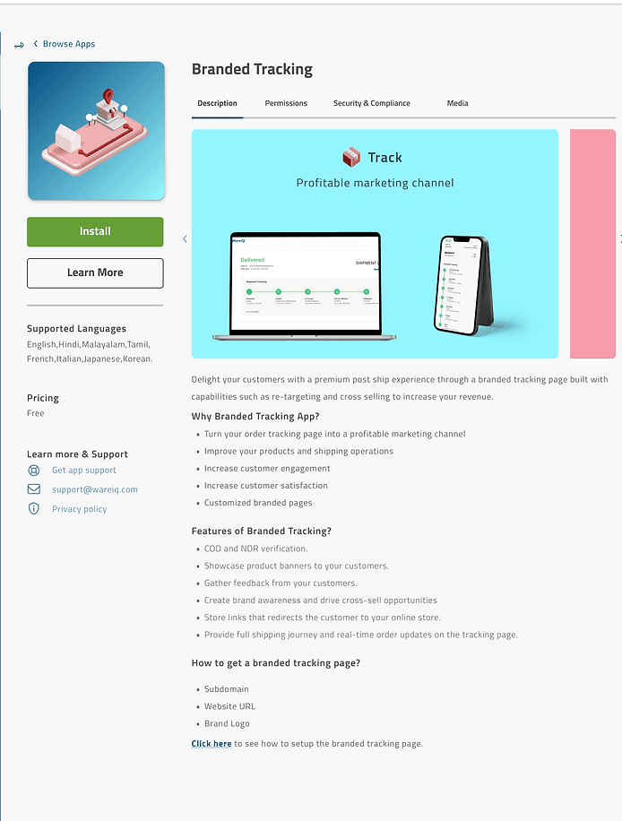
The App Store underwent a small but significant change in layout . This was the result of a lot of wireframing. The goal of the change was to make the App Store easier to use and more visually appealing.
The install button was made more visually appealing by changing its colour to green. The green colour is associated with growth, health, and safety, which makes it a natural choice for an install button. The button was also made larger and bolder, so that it would stand out from the rest of the page. These changes made the install button more noticeable and inviting, which encouraged users to click on it.
The description of the app was well organized by dividing it into sections, such as features, benefits, and how to use the app. Each section was clearly labeled and easy to find. The text was well-written and easy to understand. The overall layout of the description was clean and professional.
Feedbacks
Feedbacks after Discussion
The banner size can be reduced so that more attention can be drawn to the description and features as wel
Final Design
Changes Made
After aggregating all feedback and viewpoints from the discussion, the design was refined and prepared for development
